Spacing Options missing for Group Block (Margin, Padding) QUESTION / Possible Bug
Description:
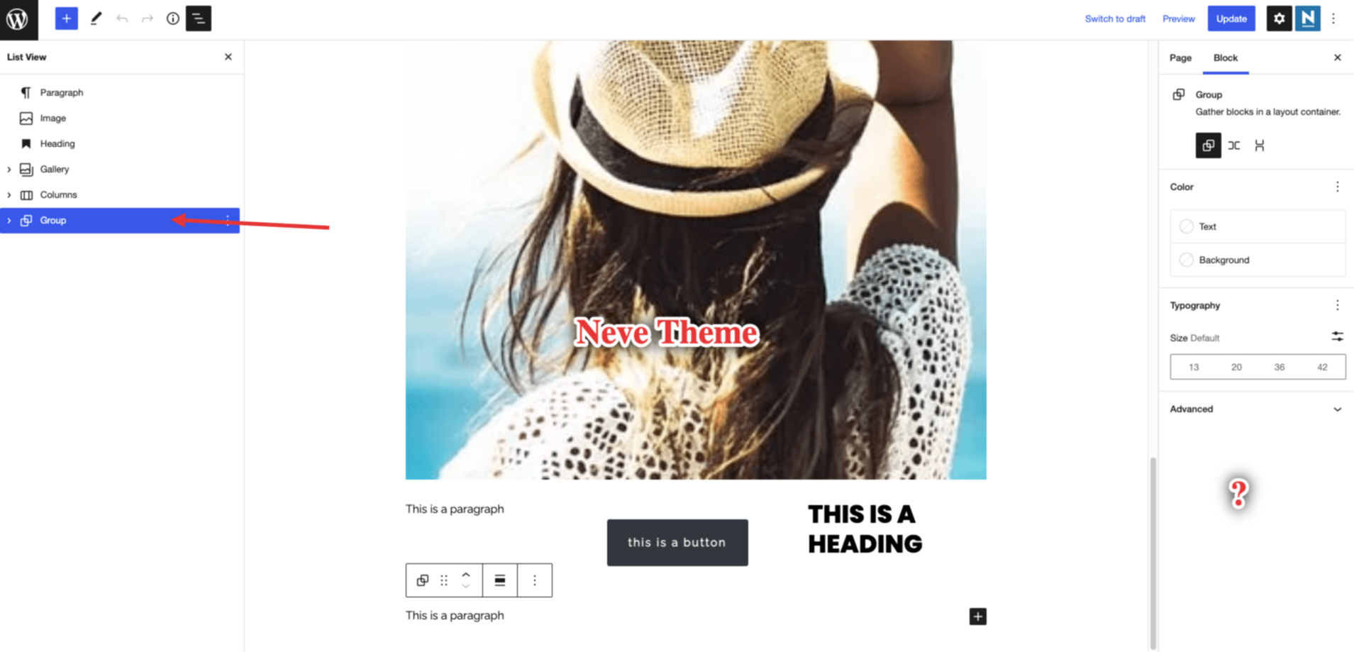
One user described that the spacing settings for this particular block are missing when using the Neve theme and it turned out to be true. When using the default 2022 Theme, you get some additional spacing block settings in the right sidebar which disappear once you switch to Neve.
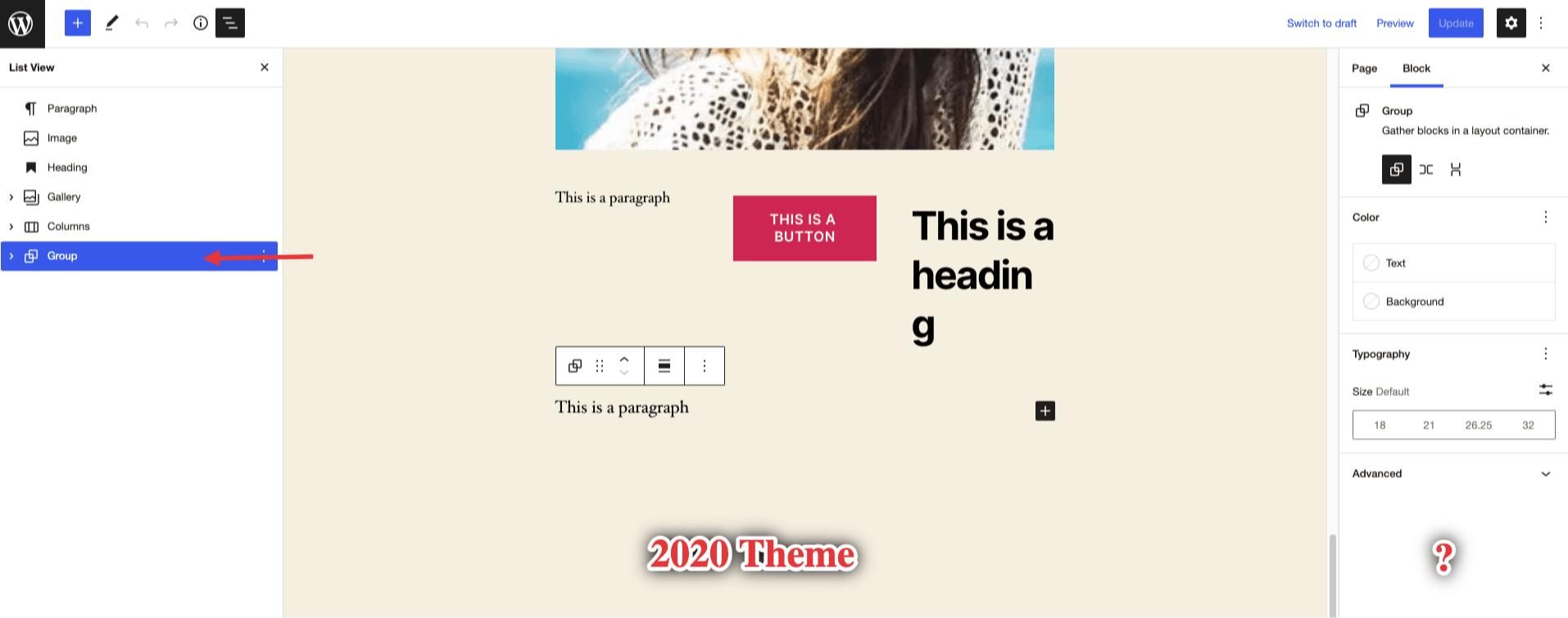
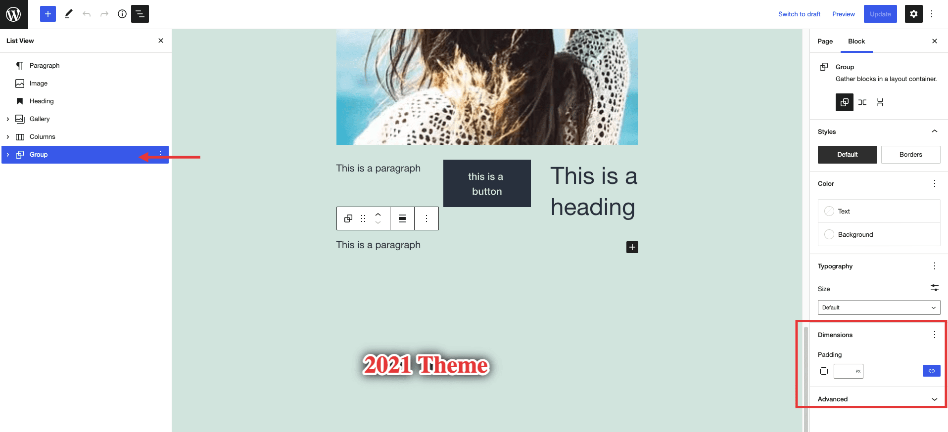
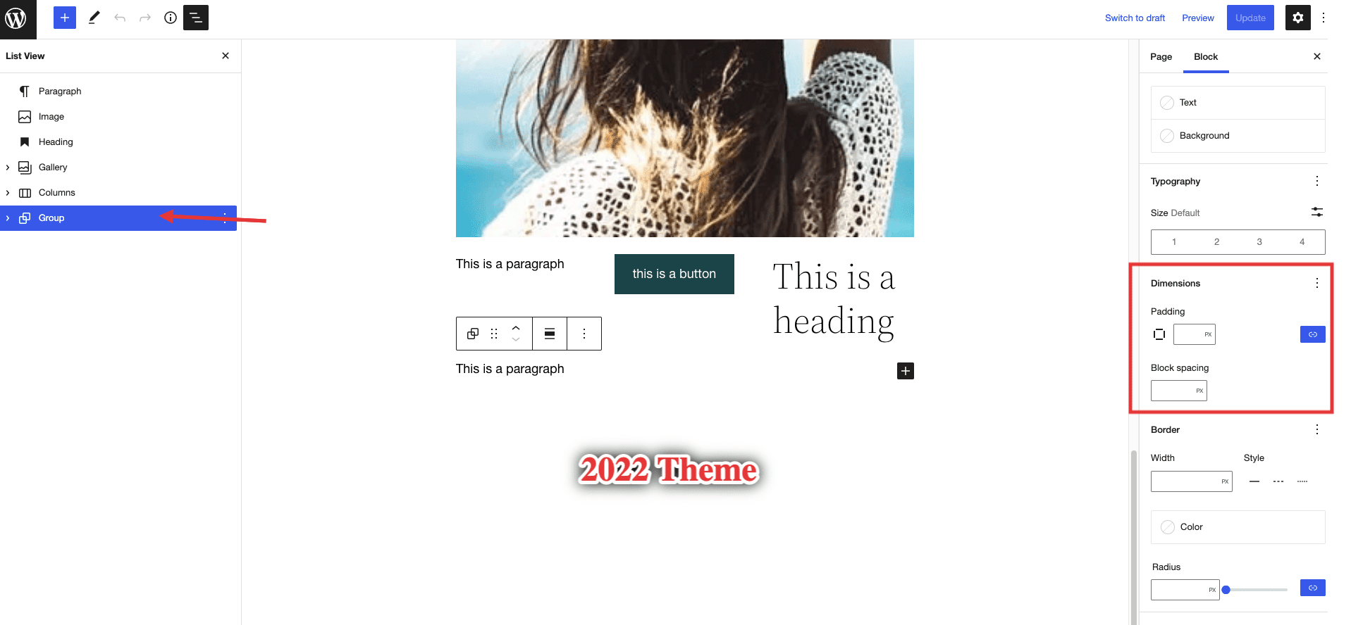
However I did some more testing and this was the block that I managed to find as being the only one with this issue, as the other blocks seem to have the same settings regardless of the theme used. Also, it got me thinking that the same settings also disappear if you use the 2020 theme, but the padding appears when using 2021 and even more options appear with 2022.
Now, this might only be related to how the themes are structured and not to Gutenberg or our theme, but I wanted to ask a question and make sure that this is the case before consolidating an answer to our users. Shouldn't Gutenberg offer the same options for blocks regardless of the theme used?
In their documentation, I have found that there should be some dimension settings available and that got me thinking even more.
Here is how different settings look like for the themes mentioned:
2020 Theme
2021 Theme
2022 Theme
Neve Theme
How to reproduce:
- Install the Neve theme and insert a Group Block on a page
- Open the Block settings and notice there are no dimension settings for the block (margin, padding etc)
- Install the 2022 theme and notice how this block has now more settings including the dimension ones
Expected behaviour:
Same block settings appear regardless of the theme used
Current behaviour:
Different block settings appear based on the theme used.
Reference:
Technical info
- WordPress version: 6.0
- Theme version: 3.2.5
Hello @abaicus,
I have tested a few things with this PR and I found that the settings do appear now, but I have tested further and found the following:
- [ ] The text color does not apply in the Editor for all the elements but it will be applied in the Front -End
- [ ] Typography settings are not applied to all text elements in the Editor (I.e paragraph) but they are applied in the front end.
- [ ] Text Transform and Typography (i.e Letter Case Option, Size, etc) are not applied to Headings within the Group
- [ ] There is no margin default value for the group block. Text can be cut by the footer or if 2 group blocks are set on top of each other the margin is visibly not there.
Here is a screencast showing the above-mentioned things in case it provides more context.
Please let me know if there is something I have missed or if I misunderstood something.
Thank you!
@Skystream96 Thanks for taking the time to test this! 👍🏻 🚀
While the typography and color findings are valid, they are unrelated to this PR.
These settings were available before as well. The only typography setting added by the current change is the line-height - which I gather wouldn't probably work fine unless set at a more specific block-level (i.e., directly on the paragraph or heading).
As stated in the developer docs 🔗, here are the things added by this change:
- border: color, radius, style, width
- color: link
- spacing: blockGap, margin, padding
- typography: lineHeight
The issues mentioned above might require a more complex fix. We'd have to find a way to override the settings we use in the customizer - which are more specific to paragraph and heading tags inside the editor than the group block settings.
It would help if you could raise another issue regarding these. 👍🏻
As mentioned in the video, the inputs only execute the onChange on blur after typing. So you must click outside before the changes actually happen in the preview. IIRC this is a conscious decision taken by WP core.
If you change the number of inputs using the Shift + Arrow Up/Down key combination, the changes will be visible for each change.
There is no margin default value for the group block. Text can be cut by the footer or if 2 group blocks are set on top of each other the margin is visibly not there.
I don't understand what is the issue here. Could you elaborate further, please? 🚀
Hello @abaicus ,
Thank you too for taking the time to provide the needed feedback! It really helps.
I will create a new issue with the Typography/Color Settings where we can test more things and see if we can find a solution. As for this particular PR then I guess the purpose was fulfilled thus I think we can move it to Ready to Merge.
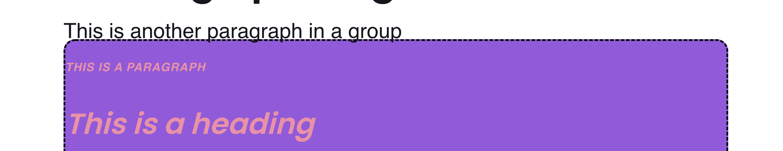
As for the last part, I have noticed that the Group Block does not have a margin/padding set by default (in case the user forgets to input it) thus if you place 2 group blocks one after the other it looks odd. (might not be an issue but I thought to mention it because as a user I would expect some spacing between blocks by default).
Here is an example with 2 group blocks on the front end where I haven't placed margin or padding. As you can see, the paragraph text from the first group block slips into the container of the second group block.
Here is a screenshot where the same group block with paragraph is set at the bottom of the page.

And I would expect it to be something like this in case I forget to input margin/padding in the group block settings.

Thank you!
@Skystream96 Thanks for taking the time to explain!
As for the last part, I have noticed that the Group Block does not have a margin/padding set by default (in case the user forgets to input it) thus if you place 2 group blocks one after the other it looks odd. (might not be an issue but I thought to mention it because as a user I would expect some spacing between blocks by default).
The controls come without any defaults (all of them are optional). From what other themes are doing:
- Twentytwentytwo theme adds a top margin to group blocks;
- Blocksy adds a margin top (this comes from content spacing);
- Astra doesn't space groups at all;
- Generatepress doesn't add any space;
- Kadence adds a margin bottom;
As I see it as a user, I'd rather solve it from the controls or by adding a spacer, but maybe @Codeinwp/design-team could chip in about this.
Thanks!
As I see it as a user, I'd rather solve it from the controls or by adding a spacer, but maybe Design Team could chip in about this.
I think it should be fine, for now, without the default top/bottom margin. As long as the Core doesn't establish new UX patterns, we should be good for now.
One small thing I noticed with Neve is when adding Background Color to a group - there won't any padding added. By default, the Core add some padding when the Bg color is enabled (see the video).
https://user-images.githubusercontent.com/52494172/177496837-c8dd5502-654d-4f02-aebe-77ec3336ceae.mov
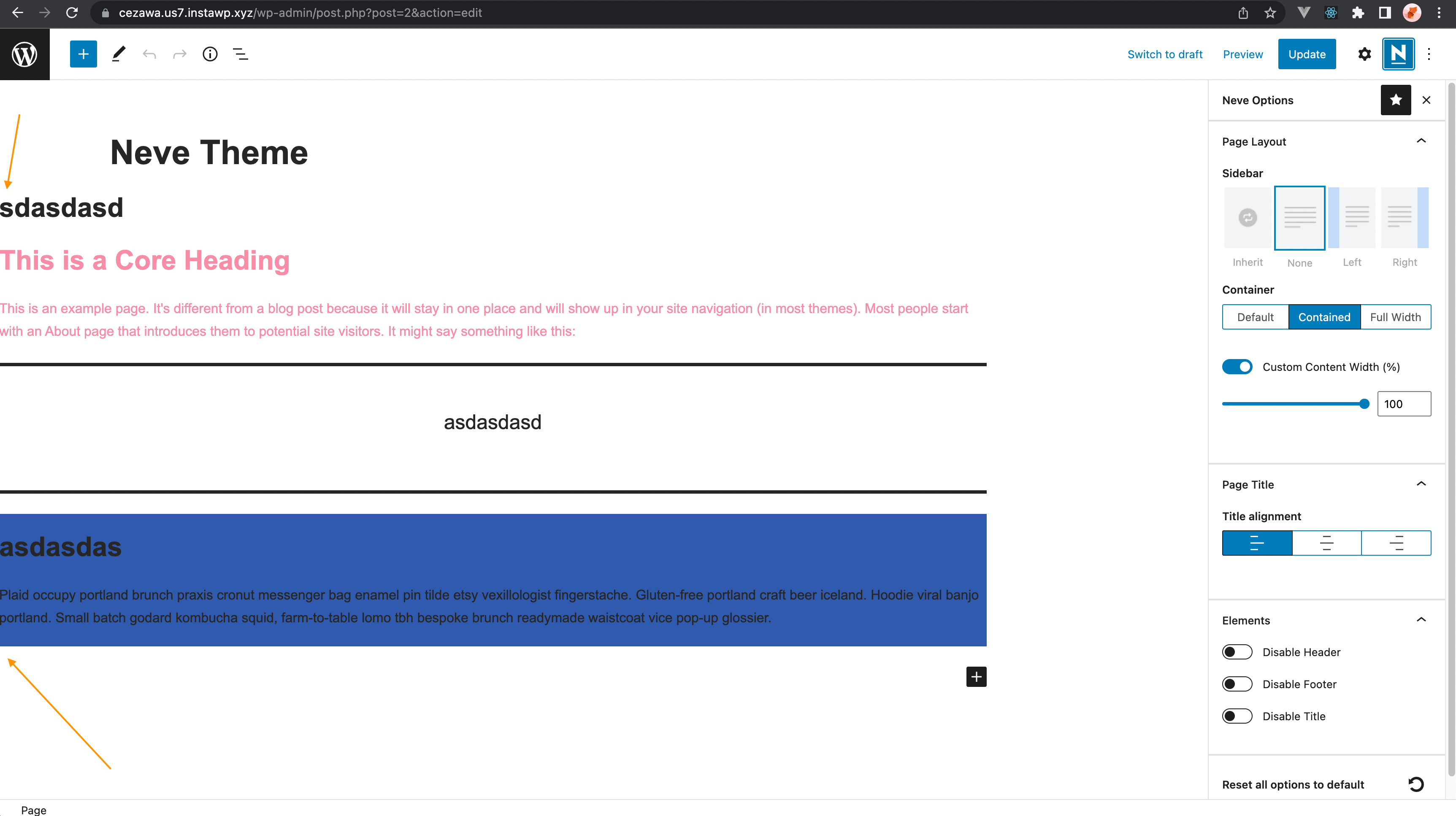
Also, I am not sure if the container with should break like this with Neve:
:tada: This issue has been resolved in version 3.3.3 :tada:
The release is available on GitHub release
Your semantic-release bot :package::rocket:
We removed the theme.json file as it produces lots of other issues. I'm opening back this ticket. We need to better evaluate the changes that this file adds.