core

core copied to clipboard
 BrightspaceUI
Feature Request: button-icon tooltip integration
What do we want to do?
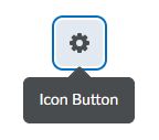
Integrate d2l-tooltip into d2l-button-icon so setting the text attribute on a button automatically adds a tooltip with the text inside.
Why do we want to do this?
- Tooltips use
aria-describedbyoraria-labelledbyto make them accessible. However, these attributes are poorly supported on non-interactive elements. As a result tooltips on static or custom elements have inconsistent accessibility across screen readers. Attaching tooltips to the nativebuttonelement fixes these issues. For more information see the tooltip README. - This gives sighted users a consistent way to see
button-icontext when the icon alone isn't enough to infer the meaning of the button.
What challenges are involved?
- Buttons may have parents that don't have
overflow: visible. This means tooltips on buttons may cause unexpected scroll or be unexpectedly cut off. The tooltip'sboundaryattribute can be used to prevent this but has problems because:- Users of
d2l-button-iconwould need to manually pass aboundaryinto thebutton-iconbased on which parent has non-visible overlow. - These components may not know if they have a parent with non-visible overflow like
d2l-calendarwhich would mean they would also need to allow a boundary attribute to be passed in. This could cause a huge chain ofboundaryattributes that need to be passed down. -
d2l-button-iconwould need to exposed2l-tooltipattributes as part of its interface.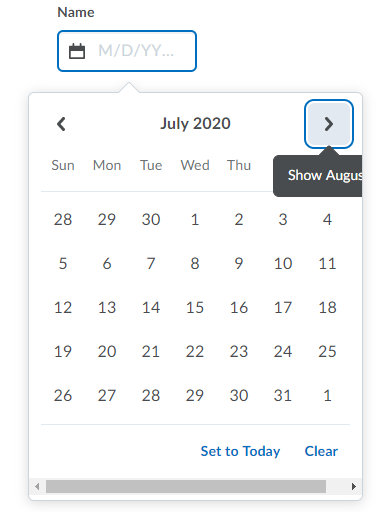
- Users of
-
Resolved: Buttons may also open other components like
d2l-dropdownwhich risks overlap. Thed2l-tooltipclose-on-clickattribute was introduced to resolve which mimics the behavior of native browser tooltips.