 BitcoinDesign
New table of contents UI
We should adopt the below style for our table of contents (TOC) used in the guide. We should be using TOC a lot more often throughout the guide, it makes content much easier to navigate, especially on mobile. Imo the below style keeps things visually clean and is easy to navigate (on desktop it stays stickied to the right so its accessible no matter where you are on the page). Our current markdown styled TOC isn't visually as nice and the text is quite small (13px).
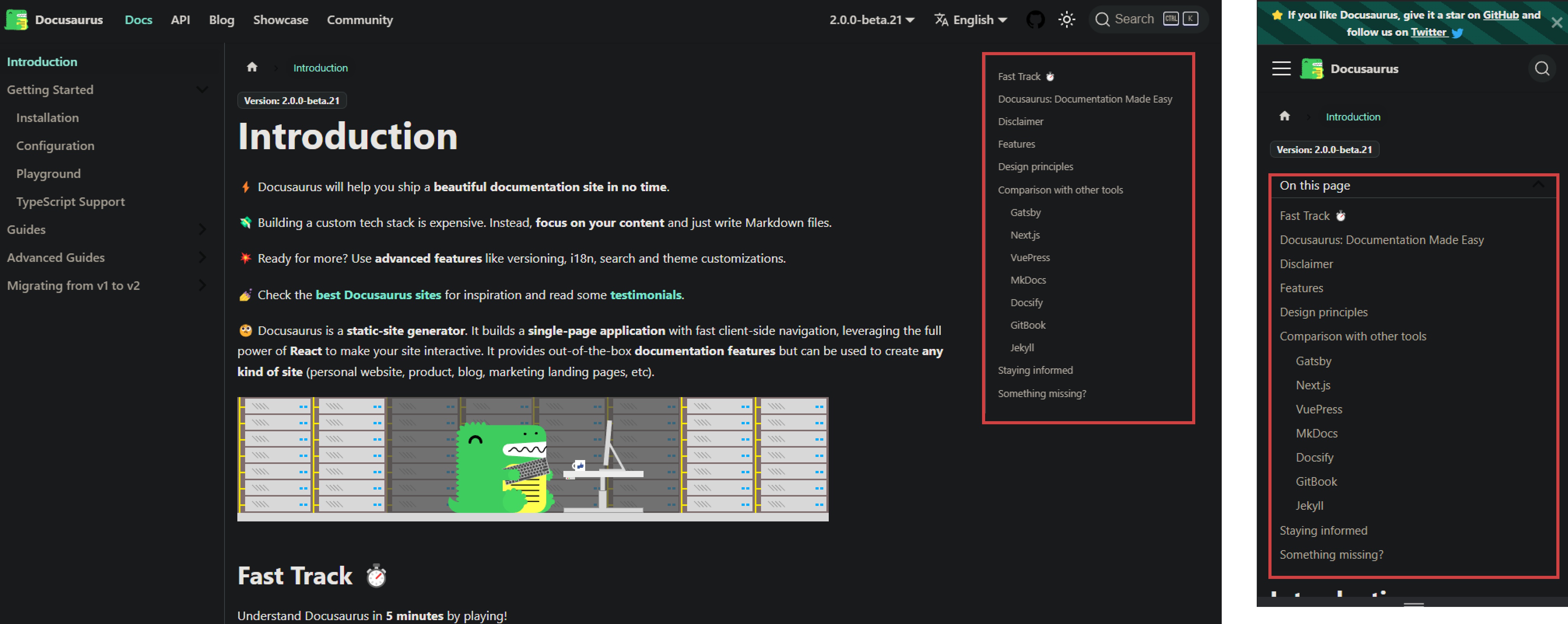
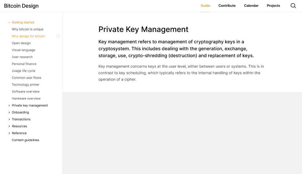
Screenshots from the Docusaurus site: https://docusaurus.io/docs
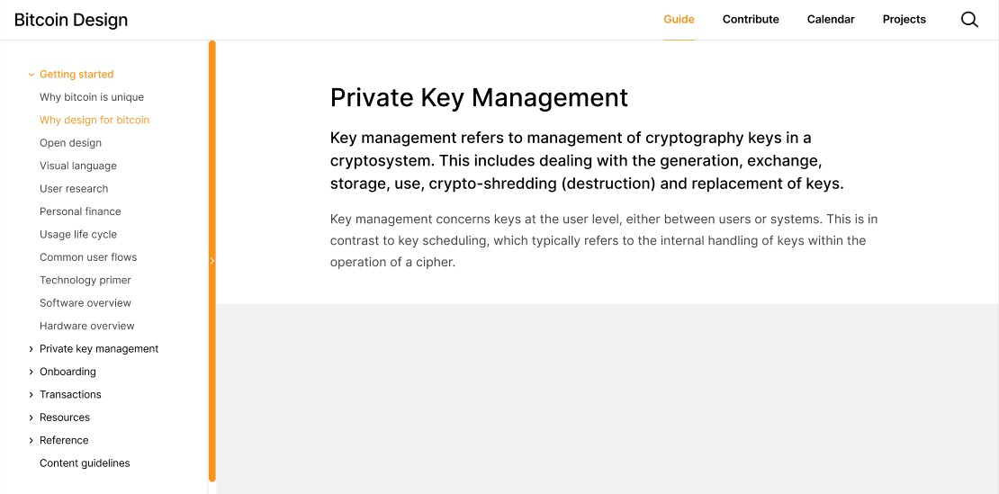
I could see that work well for super-wide screens, and should be fairly simple to implement via a media query. Font-size wise, ours at 13px is larger than the Docusaurus one, which is 12.8px.
I could see that work well for super-wide screens
My 24" still show it without making things messy, this isn't a super wide resolution.
Yeah both fonts are a little small. 14px as a minimum I think is good for web.
In my opinion this is a very helpful feature! I was thinking of implementing this, but after visiting the guide on my desktop I realized that we might not be able to add the toc at the right side of the page as in the example @Bosch-0 had put on because that won't suit the existing wireframe of the page. Instead, I have thought of 2 ways in which the toc could be integrated on the page, could someone pls suggest which one would look better?
For the first idea, I was thinking of adding a very thin #F7931A colored column beside the left panel with a small right arrowhead at the center of that small column which when clicked slides from there and shows the toc on this page. Similar to how the menubar slides from the left when we click on a hamburger menu on a website just the difference here is that instead of the hamburger menu icon, there is a thin column (of #F7931A color) on the immediate right edge of the guide contents left panel with an arrowhead at its center. To see what I'm talking about you can have a look at the second last example on this website https://speckyboy.com/slide-out-sidebars/. For the responsive design, I think the way toc is implemented on the https://docusaurus.io/docs website is just perfect.
For the second idea I had thought that as soon as the user clicks on any page say for example 'wallet security' the left contents panel splits into 2 portions the upper portion for the toc for this page and the lower one for the toc of the guide. For the responsive design, I think the way toc is implemented on the https://docusaurus.io/docs website is just perfect.
Hope you liked the 2 ideas pls suggest which one suits better, If you are unclear about any of these ideas pls feel free to ask...I will try explaining via a sketch of the wireframe of the page! And I would like to work on this issue to design the UI for toc, Please assign the issue to me.
The first idea looks something like this...
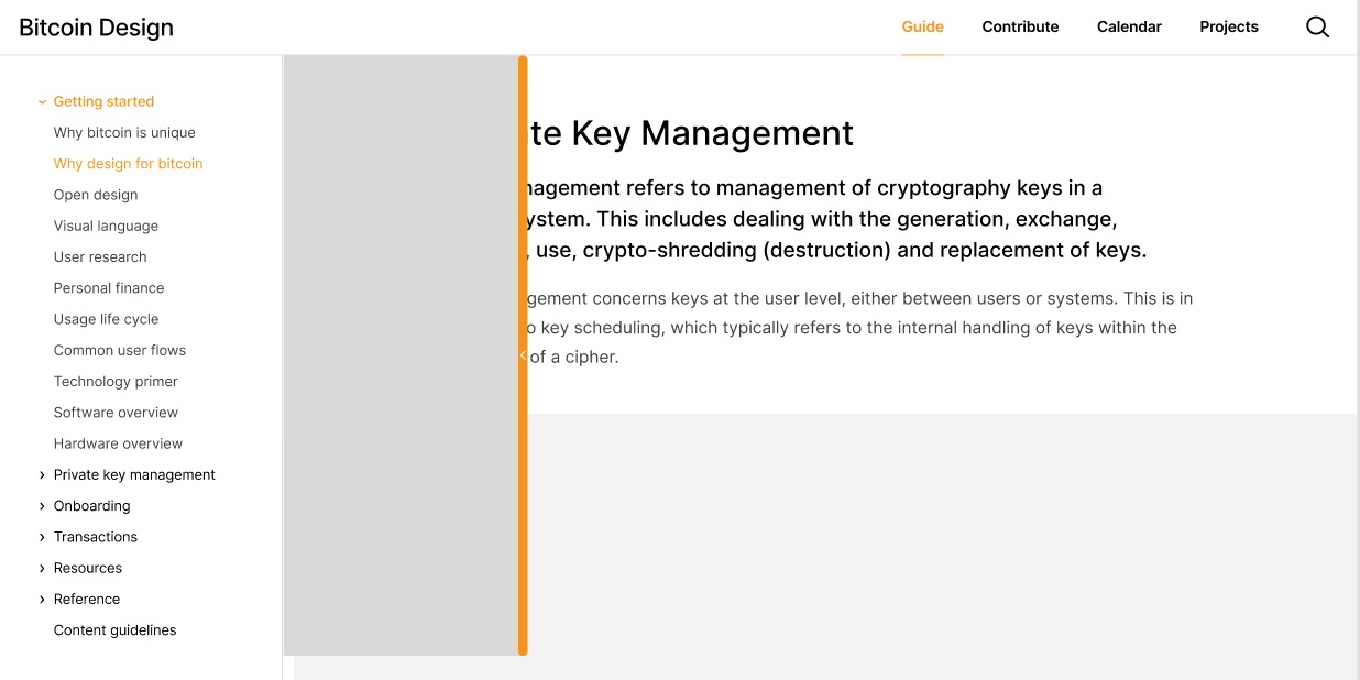 I think this looks good as the number of items for the table of contents of each page are quite less...I think a side open/close panel is a nice idea. Pls, give your feedback!
Thank you for the proposal. Overall, I think this solution is too complex. Imagine your design is implemented and your are a reader and land on this page. How would you know that the orange bar contains a hidden table of contents, since there is no indication? The orange bar draws a lot of attention, but since it only contains a small arrow, the user has to guess what it means. My first guess would have been that it expands the main navigation in the sidebar to fill the screen.
Another aspect is that this approach makes it less convenient to see the table of contents. Generally, we try to keep our pages pretty short. If a page gets too long, we try to split it up. So our tables of contents are usually short as well. Our current approach of simply having it on the page allows the user to scan it in a second without any further action. If we hide it in a second, expandable side-bar, they always have to go and find it. It's a lot of friction for seeing a list of 5 or so links.
I really think that a simple tweak here is enough that does not introduce lots of extra UI and the resulting complexity. That is just my feedback, if you feel strongly about your direction, feel free to continue exploring as you like.
Yes, I can see the problems you have listed in this design, and so I have come up with a different solution!
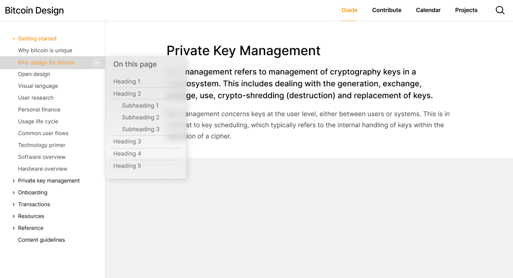
Now as soon as the user clicks on an option in the sidebar navigation the page directly loads with the toc at first so that the user can go through the content on the page in the very beginning itself and then if he/she taps anywhere on the page or on the symbol for the toc the toc disappears. To have a look again at the toc the user can once again click on the toc icon to open up the toc. As in the below image.
@GBKS What are your thoughts on this. I have tried to think of a better solution as per the problems you had pointed out on the previous design. Pls give your valuable suggestions🙂
@nityagupta6 sorry for not replying to your question here. Thanks for the additional mock-ups. I still find this option too hidden. Right now, the table of contents is easy to see when you land on the page. With our update, it is no longer visible and can only be accessed by a light grey button on desktop layouts. This makes the table of contents harder to find and harder to interact with.
Taking a step back, let's break down the ask in this issue.
We should adopt the below style for our table of contents (TOC) used in the guide. We should be using TOC a lot more often throughout the guide, it makes content much easier to navigate, especially on mobile.
This part is simply a matter of adding the table of contents to all pages. Short pages and overview pages with few headers don't benefit from this. I'd suggest to do this only for pages with a certain minimum length we can define, and a certain minimum amount of headers.
Imo the below style keeps things visually clean and is easy to navigate (on desktop it stays stickied to the right so it's accessible no matter where you are on the page).
Locking the table of contents to a sidebar is generally nice, but does not work with the layout options we have. For example, take a look at this gallery of screens on the savings wallet page. This element, as well as extra-wide images, make it so that we do not have a fixed content width that we can place a sidebar next to. We can only have one or the other.
Our current markdown styled TOC isn't visually as nice and the text is quite small (13px).
We could certainly tweak the styling, but need to first define better what is not visually nice right now. That's very objective. I'd ask @Bosch-0 to clarify this, as it's hard to act on the request otherwise.
Let me know if you'd still like to tweak this. I am personally not sure what's actionable here right now, other than adding the table of contents to all pages with that minimum amount of content. Otherwise I'd like to close this issue as it's quite old and has gone stale.