📱 Revise `Daily spending wallet` section landing page
This page is mostly a list of links. How can it be made more informative and effective.
This issue is extracted from #723.
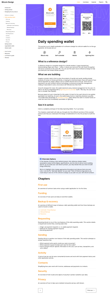
Here is a first crack at the DSW home page. I'm including a low-res picture below for quick reference, but please see the above Figma link for a more thorough review.
Things I tried to address
- Model it after coding tutorials - I think this is a format people building in tech are accustomed to
- Bring back a clear way to see the entire prototype
- Explain more clearly that this is a reference design you can use to model your own product
- Explain the idea that every page may have "alternate options" -- I liken them to lego pieces. You might decide you want to build a product that's a lot like this reference design, but you want to swap out some of our design choices with alternate options.
- Responded to feedback that we should add more details to the backup, sending, and receiving tabs.
It might be better to finalize the text on this page after we have a better idea of the structure of the other pages. (Like, is there still going to be a funding page, splitting out requesting and receiving, etc).
I have updated this document based on the feedback left in Figma. I have moved much of the text over into this google doc so we can polish that up, but I did tweak the layout some in Figma.
As we discussed on yesterday's Design Guide Jam, we can get this merged without the completed prototype. When #800 is complete, this page can be updated.