Installer

Installer copied to clipboard
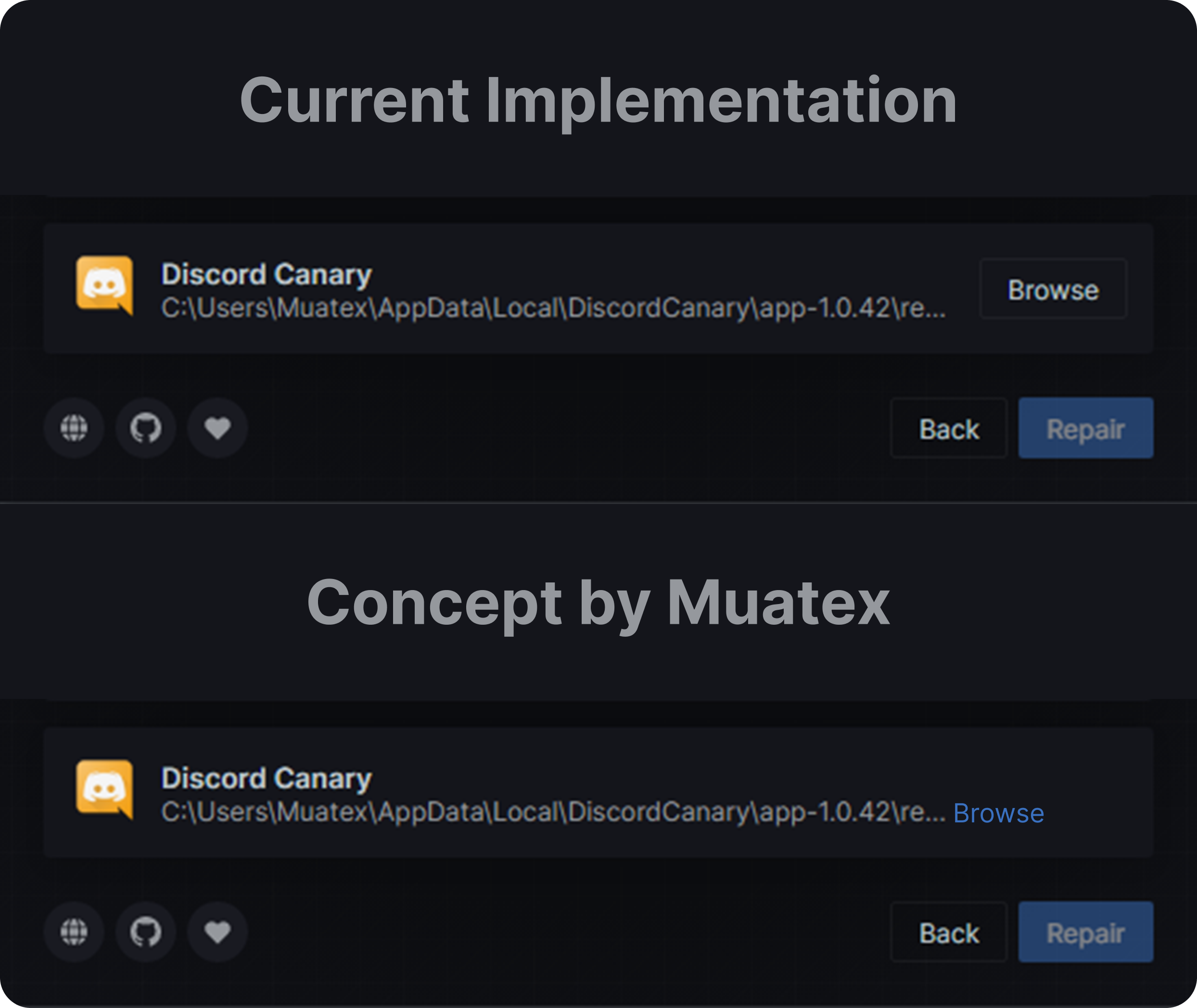
[Feature Request] Change Placement of "Browse" Button in Installation
-
Is your feature request related to a problem? Please describe.
- The installation/repair/uninstallation page has a place where you can select your Discord installation, although every time I try selecting a Discord Client version, I always seem to click the browse button, because of the placement of the Browse button makes it as if it was a select button.
-
Describe the feature you'd like
- Instead of a big browse button, put a small hyperlink next to the file directory and put the browse button, it still fulfills it purpose while still making sense.
-
Concept Design
Not sure but i look it more worst ? Less visible since less bold font , no border , blue text without border normally as url
The only pros is make the text blue which make it more visible on Dark themes
Personally I don't think this would be a good change from a UI standpoint, and arguable at best from a UX standpoint.
@Tropix126 your thoughts on this?