themes

themes copied to clipboard
 Automattic
Pique: columns(Columns Block) with wide alignment are getting cut off on mobile
Quick summary
Column blocks with wide alignment are cut off on mobile. User should be using a sidebar.
Steps to reproduce
- Activate the
Piquetheme on a test site. - On the Customizer, add any block to the
Sidebarwidget, just to make sure your site has a sidebar. - Create a new page.
- Add a
Columnblock and add some content like paragraphs and images. - Save, publish the page and check it out on mobile.
The content inside the Column block will show up cut off on the right and left sides.
What you expected to happen
I expected to see the full content placed within the column block on mobile.
What actually happened
Content is getting cut off on the edges.

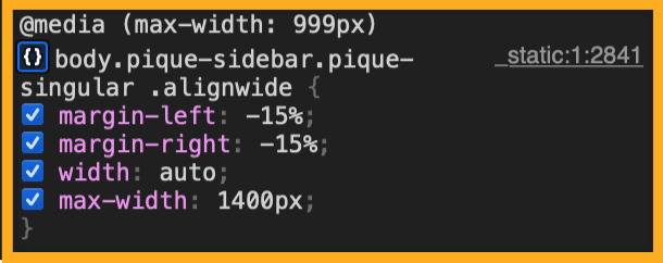
This code seems to be causing the issue here:
Context
Customer report here:
- [ ] 5453882-zen
Platform (Simple, Atomic, or both?)
Simple, Atomic
Theme-specific issue?
Pique Theme.
Browser, operating system and other notes
No response
Reproducibility
Consistent
Severity
One
Available workarounds?
Yes, easy to implement
Workaround details
If the user can add CSS code on their site, this might help:
@media  (max-width: 999px)  {
	body.pique-sidebar.pique-singular .alignwide {
           margin-right: auto;
           margin-left: auto;
  }
}
Support References
This comment is automatically generated. Please do not edit it.
- [ ] 5453882-zen
![github-actions[bot] avatar](https://avatars.githubusercontent.com/in/15368?v=4 "Published by a pub.dev verified publisher")
📌 HOUSEKEEPING
- Labels ✅
- Priority ✅
- Replicable on Core - no
📌 SCRUBBING
- Tested on Simple ✅
- Tested on AT ✅
📌 FINDINGS/SCREENSHOTS/VIDEO
- I can confirm the issue happened as described. The key things to make sure you can replica is to have a sidebar and a wide alignmnent.
- Might be related to this https://github.com/Automattic/themes/issues/2059
📌 ACTIONS
- Transferred to XYZ external rep https://github.com/Automattic/themes/