Design QA - Market Cards Updates
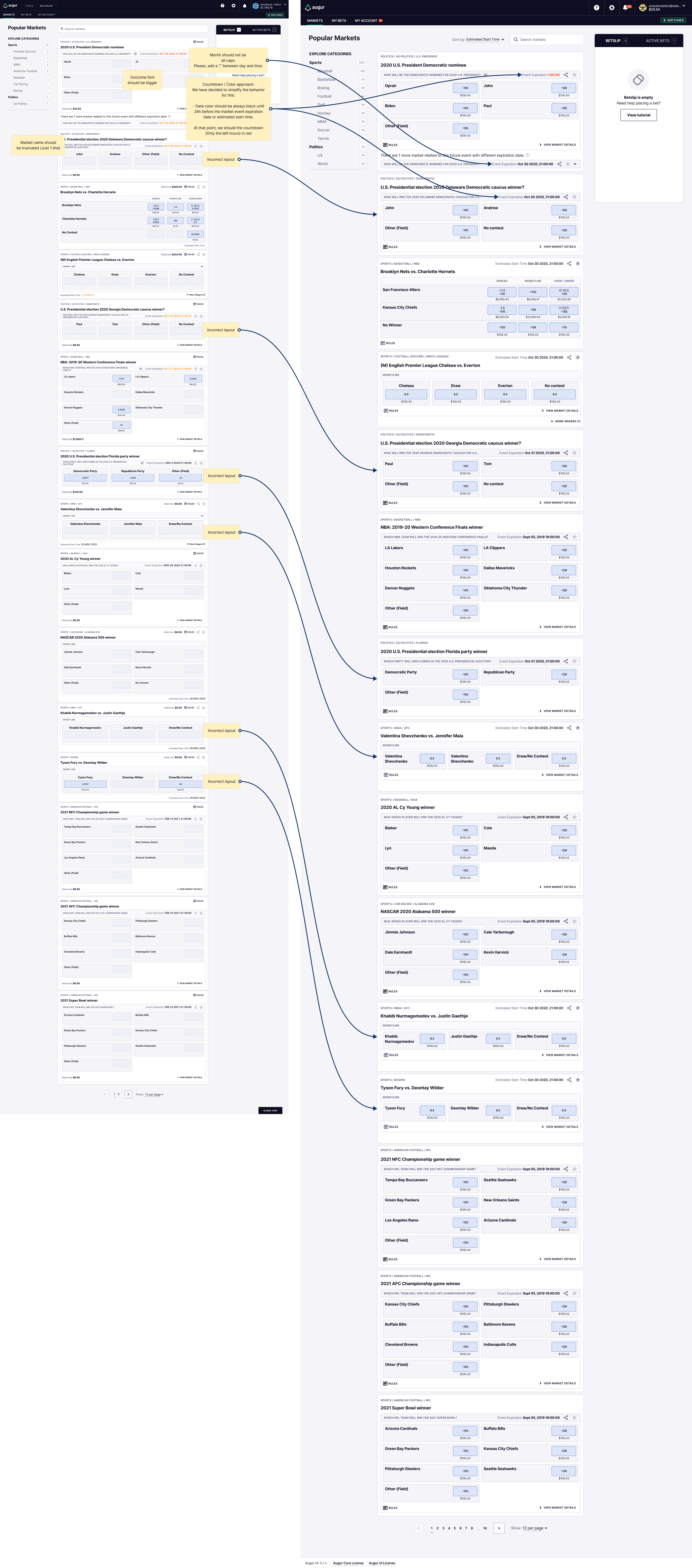
There are some markets that are not using the correct layout. And there are some design updates we prepared on the cards to make them more consistent: Basically:
- Matched amount won't be visible anymore on market cards.
- We have moved the position of the Event Expiration date and rules.
Figma reference: Desktop comments and comparison: https://www.figma.com/file/wogMuUDylgOHgTEYhZ3jgp/Augur-Bet-UI?node-id=10080%3A292764
On the design system file, you can check the updated mobile views: https://www.figma.com/file/42QoTLQcbObu7esoTPjWRv/Augur-Bet-Design-System?node-id=1140%3A0
The countdown updates I'm going to put into a different task as we need to re-write the component for this I think to allow for this. this is a common countdown we use everywhere in a generic sense with some built in behavior that would need to be changed to do what you want here.
- On desktop we should truncate title if it takes more than one line. For instance here:

- Outcomes font size is incorrect (Top dev, bottom design)
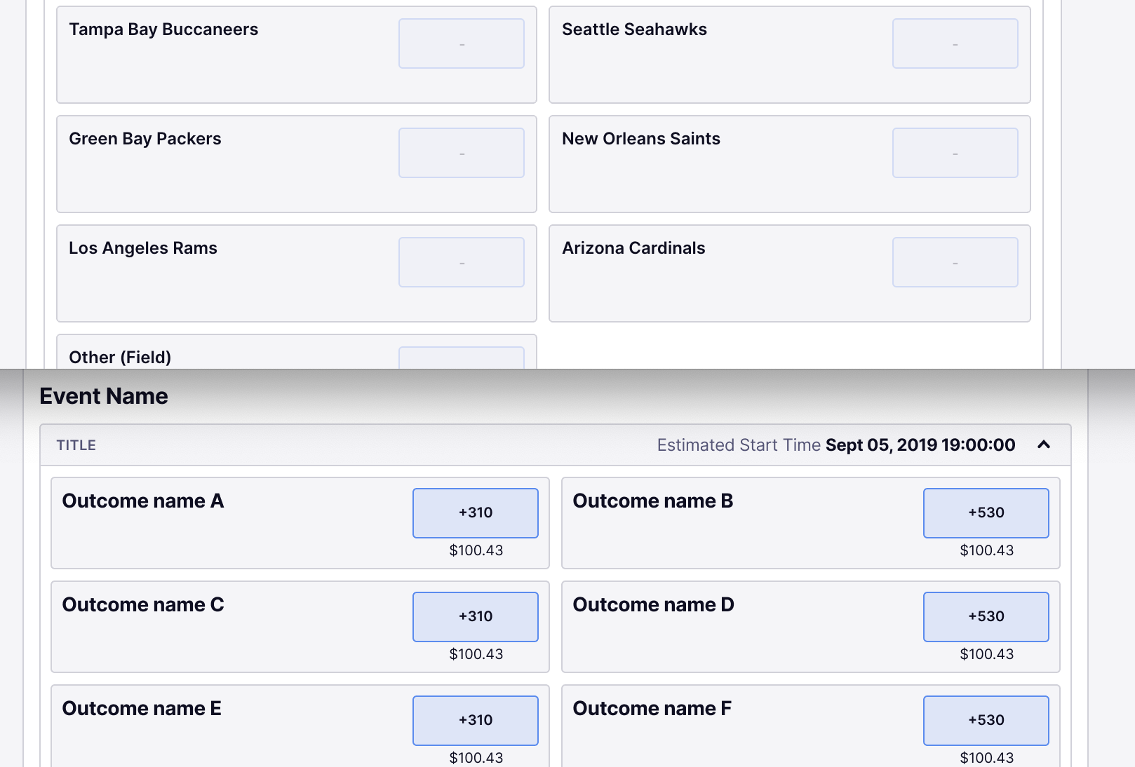
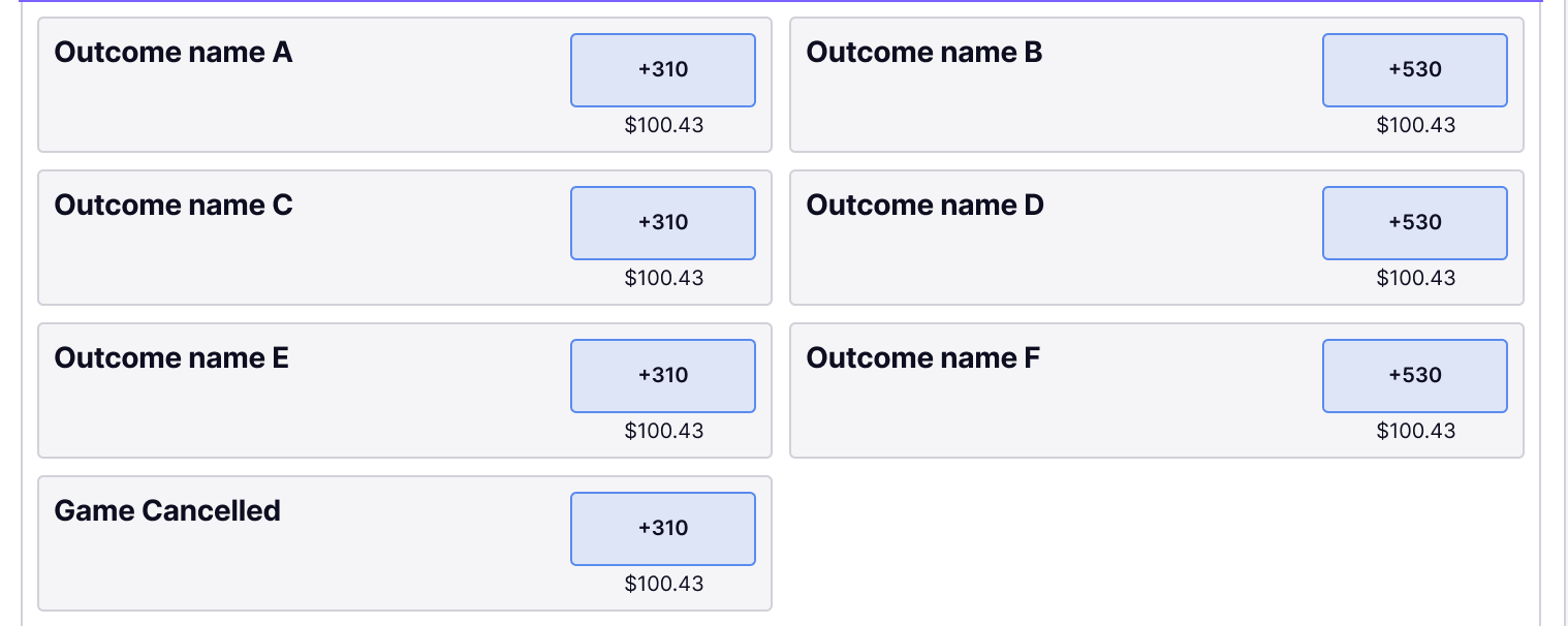
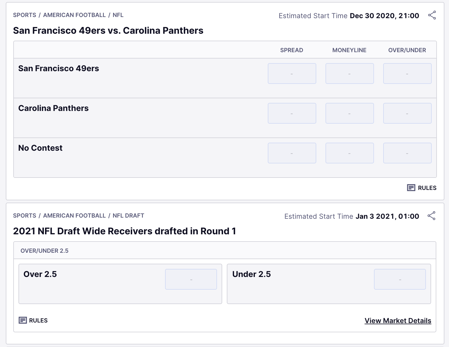
- Moneyline with more than 4 outcomes, we should use 2 rows template:
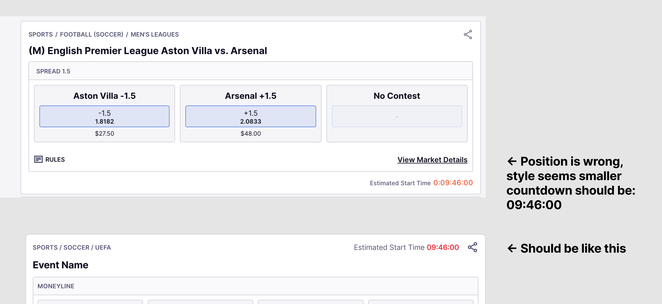
Now that we have all the possible markets on dev, we found some inconsistencies related to the Estimated Start Time position:
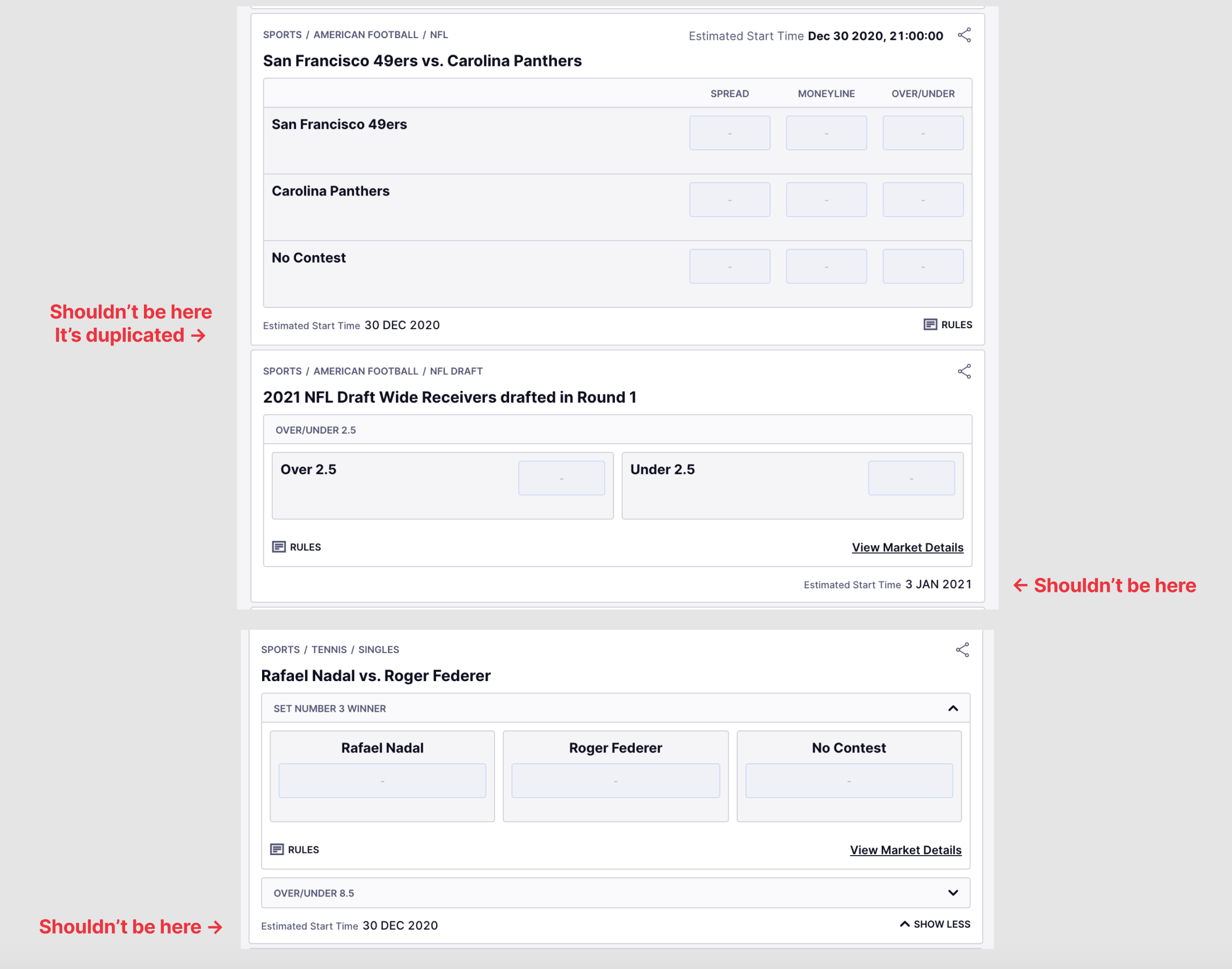
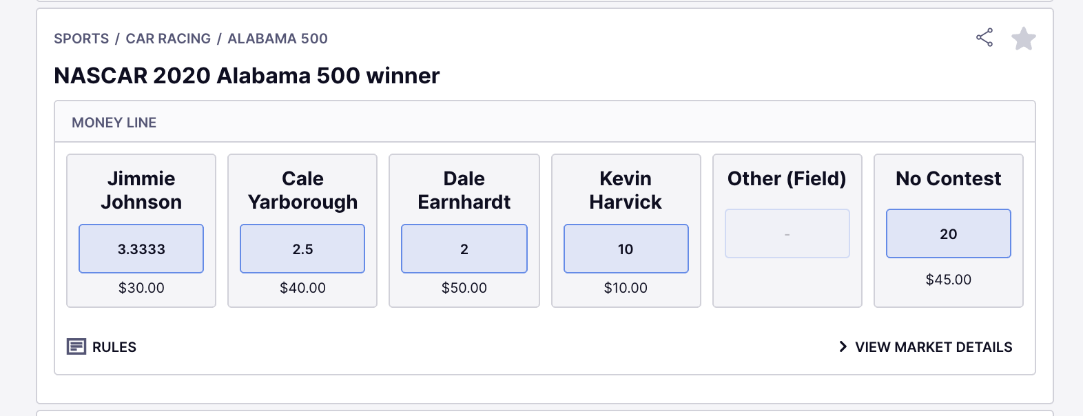
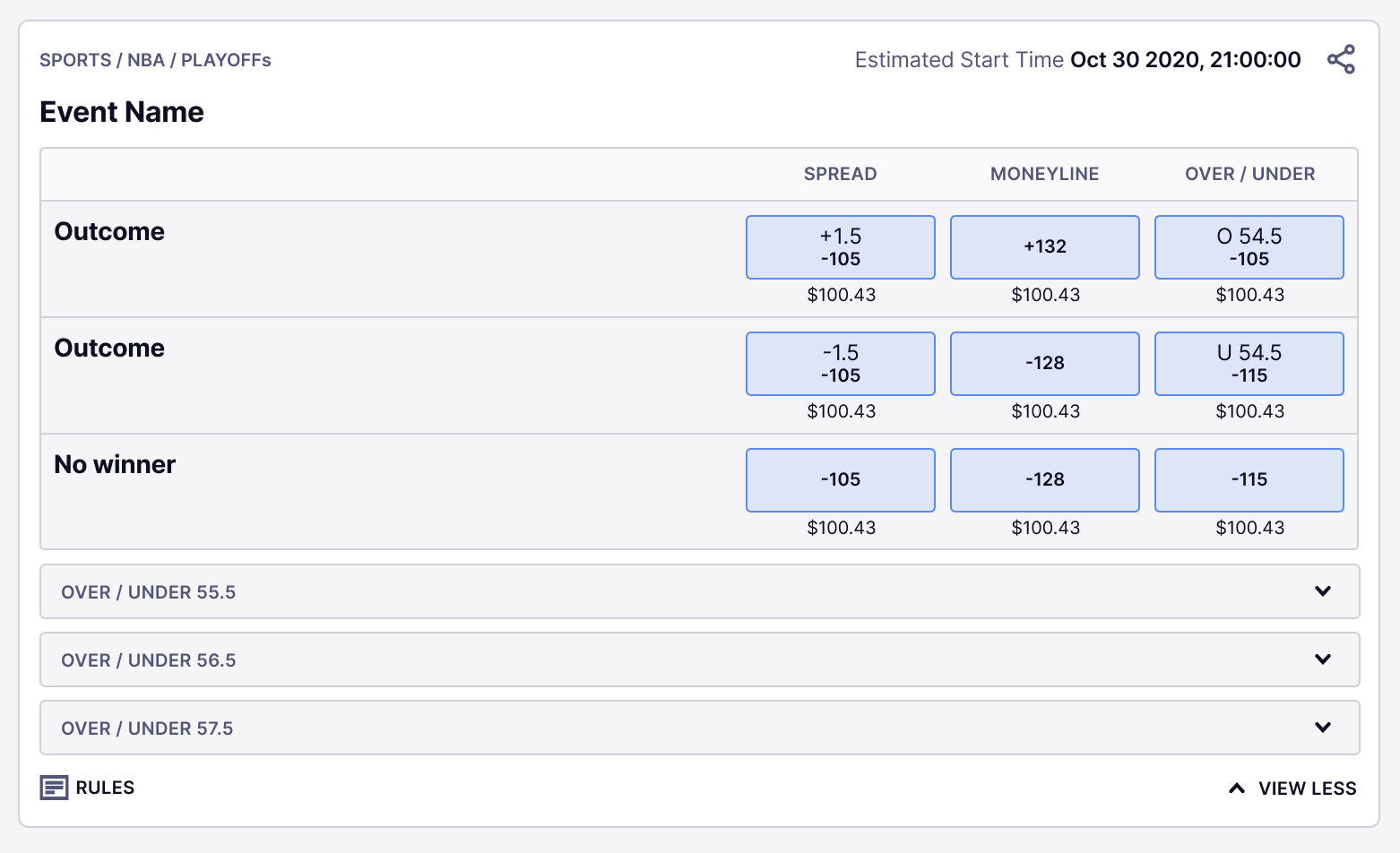
- Estimated Start time correct position: Please notice that the second image is showing an example of a Prop bet market (which is similar to Future Market Card)
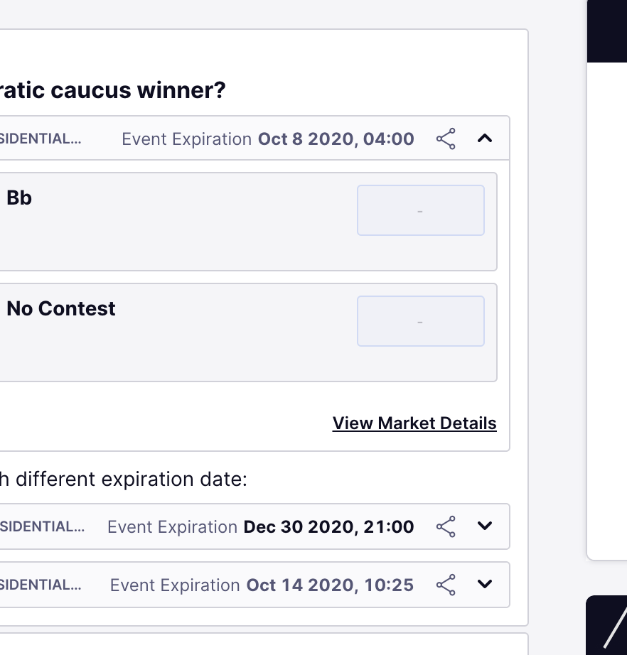
- Event Expiration Date is showing up in a different color. Is there reason why?
- Countdown should be always red (bold), and in some cases should not appear:
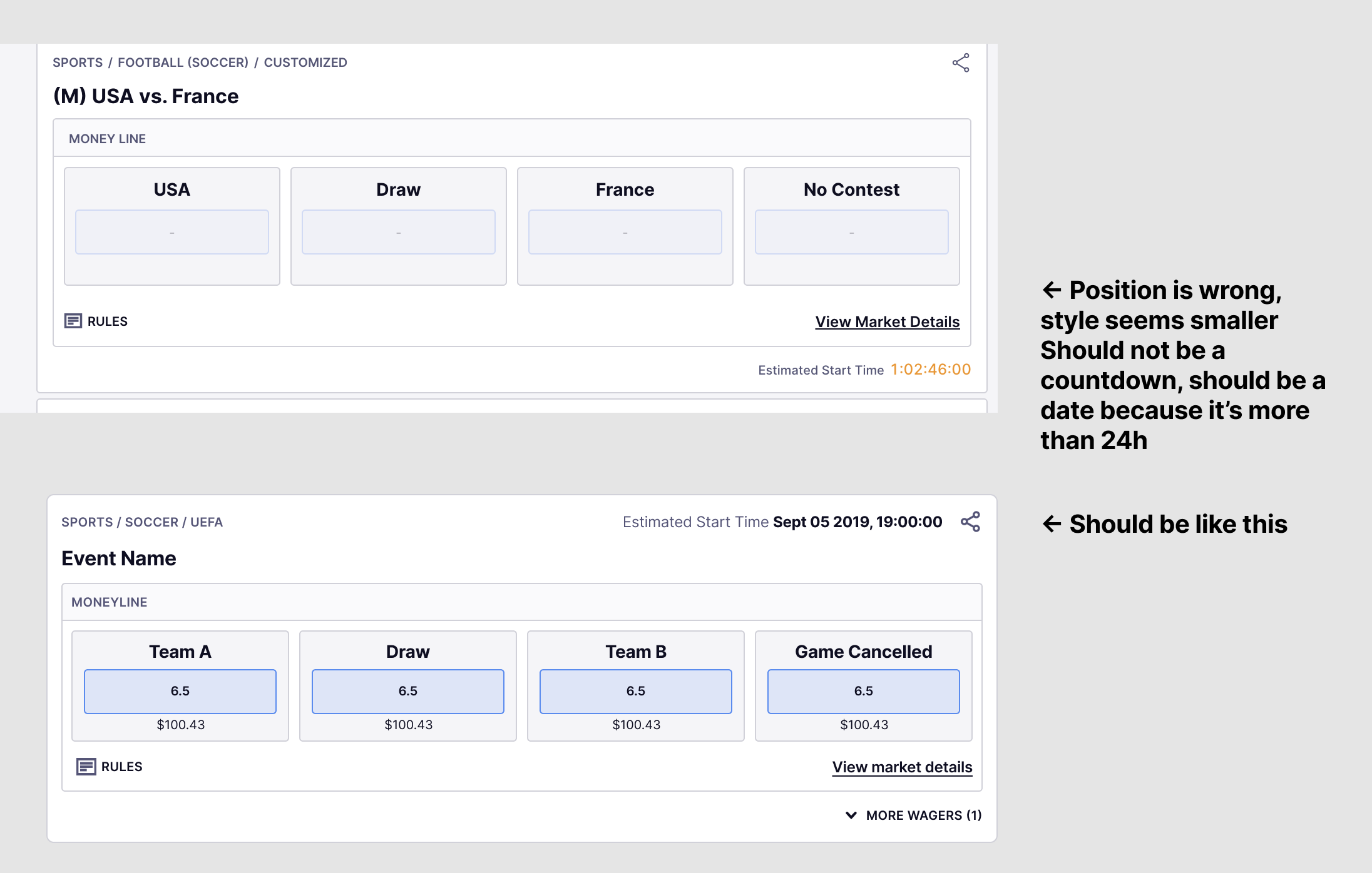
- Event expiration date ALWAYS shows up as a date, not as a countdown.
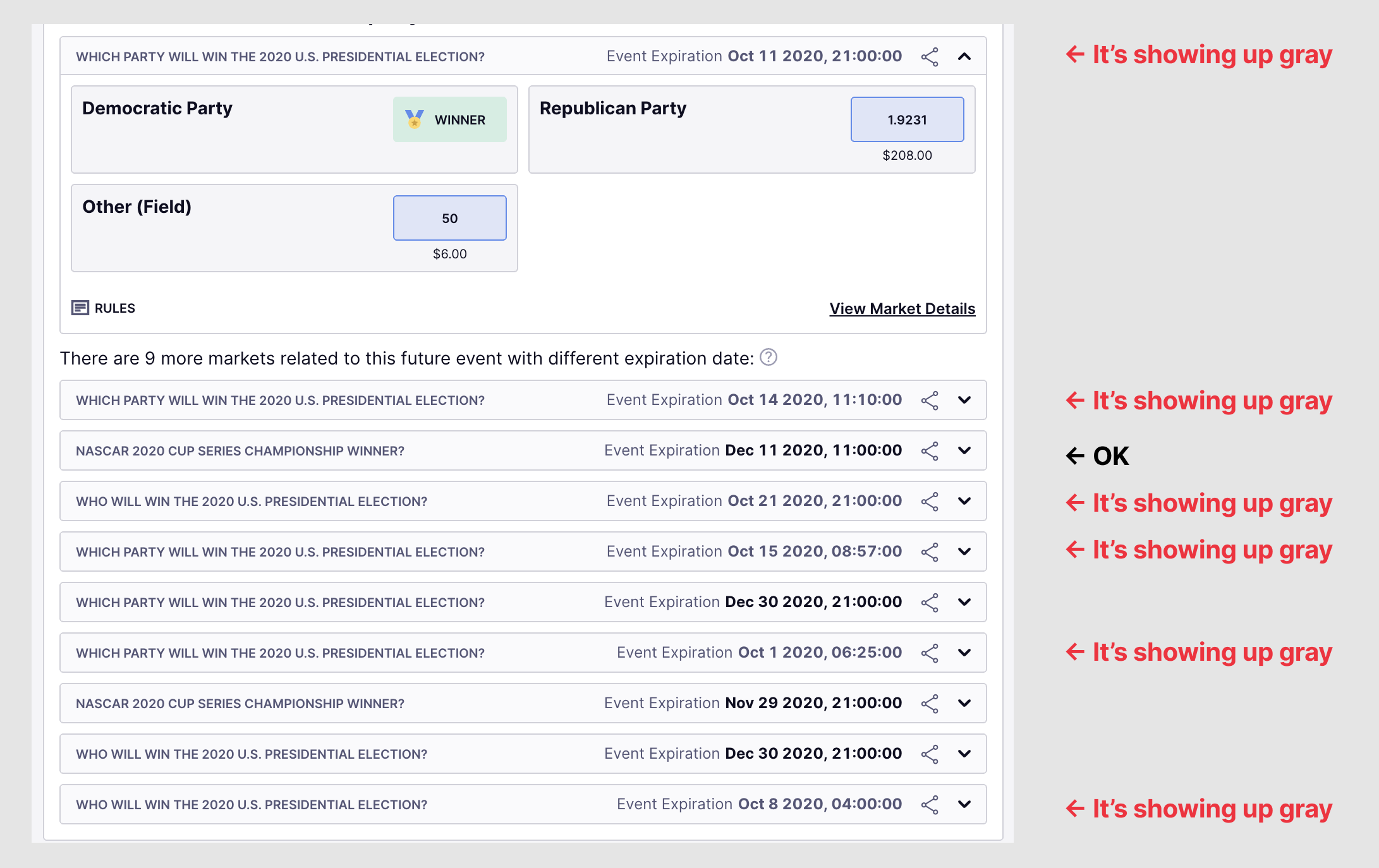
Fixes seem fine. There are minor things:
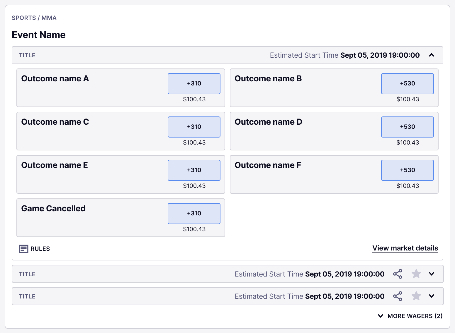
- Rules should always be left aligned: First market position is wrong
- I still see some market's date gray (First and last markets in this example). Date should be black:
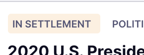
- In settlement tag margins are not the same (right margin is bigger than left one)