Niagara-Issues

Niagara-Issues copied to clipboard
Improve text contrast when showing notification text on home screen
Is your feature request related to a problem?
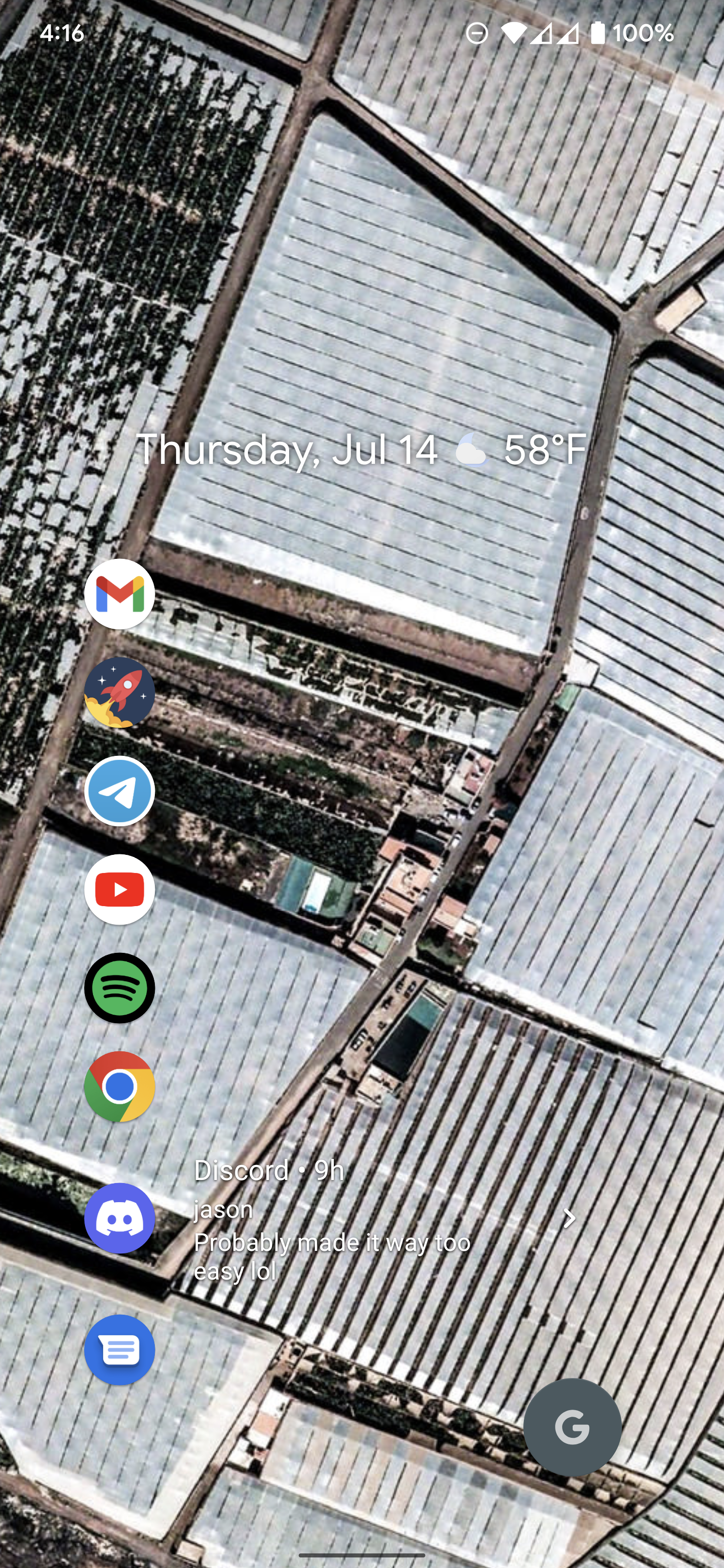
Although Niagra has settings for dimming the wallpaper in the app drawer to improve text readability, there's no similar feature for the home screen, which can lead to text that's borderline unreadable on certain wallpapers and definitely fails to meet accessibility guidelines for text contrast. (See attached image for an example.)
Describe the solution you'd like
To solve this, I recommend a selective dimming: dimming the background of the notification on the home screen only when a notification exists. This keeps the aesthetic of a full screen wallpaper most of the time while still allowing easier readability when on the home screen.
And, similar to the Dim Wallpaper feature, this could also be an optional toggle.
Feature Request Procedure
- [X] I have read the knowledge base article on feature requests and followed the steps mentioned