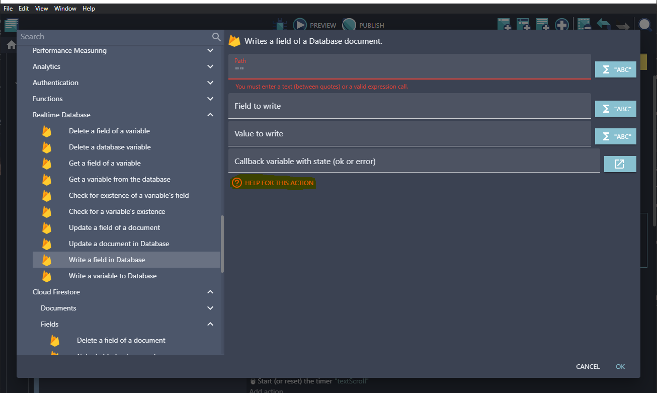
Help button is harder to find
I don't use the new action/condition editor, but I noticed in a forum screenshot that the help button is in the lower left corner of the window, while in the old editor, it's much more visible/convenient, right under the event settings. Has it been moved away on purpose? 🤔
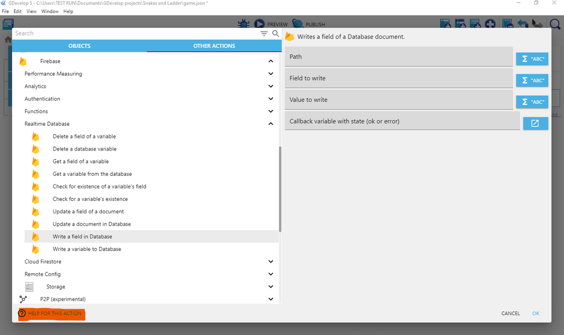
Well this has been ages since it's there now 😅 We really need to disable the old action/condition editor btw, the new one is equivalent if you use the search bar.
As for the button, this was to make it consistent with the positioning of the Help buttons in other dialogs. I'm happy to move it again, but it's not standard to put the help button "a bit randomly" after a list of parameters - and we should have more than one user feedback to know if this really matters at all or not?
I agree that it's a bit funny to have the button in a different place depending on the number of parameters, but that also seems like the best place to have it, for users discovering the software (i.e. not aware that there is a help button): user opens an event, user browses the parameters, user feels lost, user sees the help button right below the last parameter, user clicks. 😁
Placing an event-related button in the left-side dedicated to the categories looks bad to me, UX-wise.
It could be placed, either next to the Cancel/OK buttons, or in the top-right corner, next to the description, or in the lower-left corner of the right side.
We really need to disable the old action/condition editor btw, the new one is equivalent if you use the search bar.
If I want to use the search bar or the new editor, I use the right-click builder. But sometimes, the old editor comes in handy.
That's fair enough, it's true that this might be better placed near the description, even if just as an icon or in some other way 🤔